Well, yes. I think we’re in “violent agreement” on this, just saying it differently.
Maybe I’ll just withdraw my “tangentially-related” characterization and replace it with “un-related”.
Well, yes. I think we’re in “violent agreement” on this, just saying it differently.
Maybe I’ll just withdraw my “tangentially-related” characterization and replace it with “un-related”.
Santa Clara, San Mateo, and San Francisco counties (i.e., Silicon Valley) all moved into the yellow / medium tier this week. Given how many people are acting like the pandemic is over it’s hardly surprising.
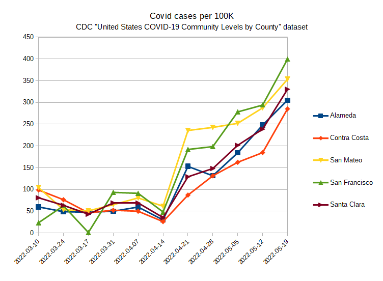
This is not great news:
There’s always sewage.

As I expected, Alameda County’s in the yellow tier this week.
Is this the only thing that tipped it over the threshold from green? I’ve noticed that in general, testing has been going up quite a bit lately, and with more testing there will be more known cases. I don’t think that cases should be included as a metric for this anyway, as you know.
During last summer’s Detla surge, this statistic was under 50. Yes, case rates are the only thing that bumped us from low to medium, because that’s the early warning. Hospitalizations and deaths lag, and are certain to go up in a few weeks.
Sewage tests show the same thing.
The San Francisco Bay Area has California’s highest coronavirus case rate — nearly double that of Southern California — and coronavirus levels in sewage for much of Silicon Valley have more than doubled over the last two weeks. “They’ve been steadily climbing for about a month, and they’re above what we saw at the height of Delta,” last summer’s dominant variant, Cody said of viral levels in wastewater.
Testing hasn’t gone up enough to account for much of that surge.

https://www.latimes.com/projects/california-coronavirus-cases-tracking-outbreak/alameda-county/
Wastewater sampling is an evolving technology with a lot of potential. I don’t know much at all about the process, but on this plot it looks like there were periodic grab samples taken on three consecutive days to give weighted “points” for each set. The weighted points were then connected in a piecewise linear way.
A continuously sampled source, giving a running average, would – if technologically possible – reduce the scatter (and decrease error bands). The scatter here is pretty wide on the last three sets, for example.
It would also be of interest to have a numerical scale on the vertical axis (no matter how arcane-seeming the units) so to see if the vertical axis goes to zero. If not, the steep rise from April 4 is visually exaggerated.
Details of what’s on the chart:
The whole Bay Area is at the Medium level this week. Same for LA, just barely. New York City is High since hospital admissions per 100K were 10.4.
And at least the covid cases are very vastly underreported - many people within companies have tested positive over the last months but only at home and their cases will never appear in any statistics - my guess is that the number of covid cases is at least 3-4 times higher than officially reported.
I believe everyone I know who had a positive quick test followed up with a PCR.
In many companies (and schools) I know that is not the case - I know at least 30-40 people who tested positive in the last 2-3 weeks by multiple rapid test but didn’t confirm by PCR and simply stayed at home until they tested negative
Meanwhile, back in Sweden:
https://abcnews.go.com/Health/wireStory/sweden-5th-covid-19-shot-people-65-pregnant-84929370
Not really backed by any scientific data but Sweden didn’t handle the pandemic well in any way
I haven’t even had my fourth yet, and don’t plan to until later this year – like in September, maybe. I’m going to ask my PCP about that, though.
I got my second booster two weeks ago since we’re in the second-biggest surge of the pandemic and I got my first booster five months before that.
At least per this overview, Sweden had fewer excess deaths than most countries.
On Worldometer, Sweden is currently listed as 57th (world-wide) in the number of deaths per 1M population since the pandemic began. The US comes in at 18th.
(Click on the column heading deaths / 1M pop)